Your front porch serves as the gateway to your home, making that crucial first impression for guests and passersby alike. We know how important it is to create a welcoming entrance that reflects your personal style while boosting your home’s curb appeal and overall value.
The right paint color can completely transform your porch from ordinary to extraordinary. Whether you’re working with traditional wood columns, modern metal railings, or classic brick accents, we’ve discovered that strategic color choices can make your entrance feel more inviting and visually striking.
From timeless neutrals that complement any architectural style to bold statement hues that showcase your personality, we’ll explore the most popular front porch paint ideas that’ll make your neighbors take notice. These proven color combinations will help you create an entrance that’s both beautiful and practical for years to come.
Classic White Front Porch Paint Ideas for Timeless Appeal
White remains the most popular choice for front porch paint because it creates an inviting atmosphere that complements any architectural style. We’ve seen countless homes transform their curb appeal with these versatile white paint combinations.
Crisp White with Black Accents
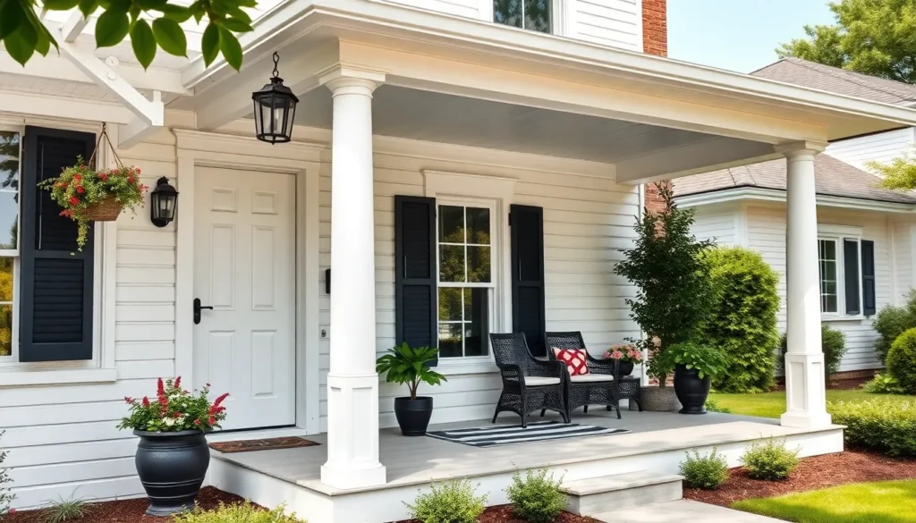
Pure white paint paired with black trim creates the most striking contrast for front porches. We recommend Benjamin Moore’s “Chantilly Lace” for the main porch surfaces combined with “Onyx” black for railings, shutters, and door frames. This combination works exceptionally well on Colonial, Craftsman, and Farmhouse style homes.
Bold black accents define architectural features while maintaining classic elegance. Paint your porch ceiling in the same crisp white, then add black metal hardware like door handles, house numbers, and light fixtures. The contrast draws attention to your home’s best features while creating a sophisticated entrance.
Strategic placement of black elements prevents the all white look from appearing flat. We suggest painting porch steps in black or dark charcoal to create visual weight at the base. This technique grounds the design and makes the white porch appear more substantial and intentional.
Off-White and Cream Combinations
Warm off white shades create a softer alternative to stark white paint. We love Sherwin Williams “Creamy” or Benjamin Moore’s “Cloud White” for homeowners seeking a more relaxed coastal or cottage feel. These colors work beautifully with sage green, soft blue, or lavender accent colors.
Cream colored paint adds richness while maintaining the timeless appeal of white. Consider pairing Benjamin Moore’s “Moonlight” with deeper cream trim colors like “Windham Cream” for subtle depth. This monochromatic approach creates sophistication without the harsh contrast of pure white and black.
Layering different white tones adds visual interest without overwhelming the design. We recommend using the lightest shade on vertical surfaces like walls and columns, medium tones on horizontal elements like railings, and the deepest cream shade on the porch floor. This creates natural flow and prevents the space from looking washed out.
White with Natural Wood Elements
Combining white paint with natural wood creates the perfect balance of classic and rustic charm. We suggest painting porch walls and ceilings in bright white while leaving wood floors, beams, or columns in their natural state with clear protective stain. This approach works exceptionally well on Craftsman and Prairie style homes.
Stained wood accents warm up pure white paint and add organic texture. Choose honey oak, cedar, or pine stains that complement your home’s existing wood features. The natural grain patterns create visual interest against the smooth white painted surfaces.
White painted trim around natural wood elements creates definition and polish. We recommend outlining wood beams, posts, or decorative brackets with white trim paint to make these features pop. This technique highlights the craftsmanship while maintaining the fresh, clean appearance that makes white porches so appealing.
Bold Color Front Porch Paint Ideas to Make a Statement

Painting your front porch in bold colors creates a striking focal point that instantly boosts curb appeal. Deep, rich hues work exceptionally well to highlight architectural details and add distinctive personality to your home exterior.
Deep Navy Blue Porches
Deep navy blue stands as a timeless, energetic color that makes a strong statement without overwhelming your outdoor space. Benjamin Moore’s Hale Navy emerges as a popular choice for porches and works beautifully on floors, railings, or entire porch areas. This versatile shade pairs perfectly with crisp whites and other complementary colors for striking contrast and vibrancy.
Navy paint like Benjamin Moore’s Deep River creates a cozy, cocoon-like effect that maintains year-round appeal. Deep blue porches catch the eye from street level and convey elegant sophistication while remaining stylish enough to enhance your home’s overall aesthetic. We recommend using navy as a versatile backdrop for bolder décor accents that can change seasonally.
Forest Green Exterior Paint
Forest green shades like Charleston Green or Benjamin Moore’s Black Forest Green provide rich, almost-black hues that work exceptionally well as porch focal points. These sophisticated tones can freshen up porch furniture while effectively hiding dirt and wear from daily use. Muted or deep green colors tie your porch seamlessly into natural surroundings such as lawns and gardens, creating a beautiful indoor-outdoor connection.
Sherwin-Williams Jasper or Greenblack adds remarkable depth and sophistication to porch elements like floors or doors. Forest green tones work particularly well in homes surrounded by mature landscaping, as they complement the natural environment while making a bold design statement.
Rich Burgundy and Wine Tones
Rich burgundy or wine-colored paint adds warmth and drama that transforms any front porch into a welcoming focal point. These bold colors offer striking visual impact and beautifully complement natural wood tones or neutral exterior walls. Deep red shades work exceptionally well on porch floors, ceilings, or doors to create a distinctive, memorable look.
Wine tones provide an excellent alternative to traditional neutrals while maintaining sophisticated appeal. We suggest pairing burgundy porch paint with neutral trim such as classic whites or soft off-whites to balance the overall appearance and prevent the color from becoming overwhelming.
Neutral Front Porch Paint Ideas for Versatile Style

Neutral front porch paint colors offer the perfect foundation for creating a welcoming entrance that adapts to changing seasons and decor styles. These versatile shades provide timeless appeal while allowing homeowners to experiment with accent colors and accessories.
Warm Gray Color Schemes
Warm gray hues create a sophisticated backdrop that complements virtually any architectural style. Sherwin Williams Front Porch SW 7651 delivers a cool mist gray with subtle cyan undertones, establishing a gentle mood that works beautifully across different home designs. Southern designers consistently favor warm gray blends that combine cream, brown, and gray tones to add subtle contrast without overwhelming the outdoor space.
Gray paint schemes offer exceptional flexibility when pairing with accent colors. Traditional navy or dark green accents create rich, layered looks that enhance the overall visual appeal. We recommend using these deeper tones on porch railings or trim elements while maintaining the gray base on larger surfaces like walls and ceilings.
Beige and Taupe Combinations
Beige and taupe create warm, neutral palettes that feel both timeless and welcoming to guests. These earthy shades provide soft contrast against natural wood and brick elements commonly found in porch construction. Blending cream, brown, and gray tones together offers incredible versatility, allowing the porch to harmonize seamlessly with both light and dark exterior color schemes.
Taupe based combinations work exceptionally well for homeowners seeking understated elegance. The warmth of these neutral tones creates an inviting atmosphere while maintaining enough sophistication to complement upscale architectural details. We’ve found that layering different taupe shades adds depth without creating visual chaos.
Soft Sage Green Options
Soft sage green tones excel at integrating porches with surrounding landscaping elements. Benjamin Moore Hancock Green and Sherwin Williams Supreme Green represent ideal choices in this color family, offering calming nature inspired vibes. These hues contain strategic mixes of green, blue, and gray that create sophisticated outdoor spaces.
Sage green paint schemes complement natural materials beautifully throughout porch designs. The subtle green undertones work harmoniously with natural wood tones and outdoor copper lighting fixtures, making the porch feel like a natural extension of garden spaces. We suggest pairing these soft greens with light gray or off white porch floors to maintain brightness and visual cohesion.
| Recommended Neutral Colors | Brand | Color Name | Best For |
|---|---|---|---|
| Warm Gray | Sherwin Williams | Front Porch SW 7651 | Main surfaces |
| Soft Sage | Benjamin Moore | Hancock Green | Nature integration |
| Soft Sage | Sherwin Williams | Supreme Green | Outdoor harmony |
| Accent Colors | Various | Navy/Dark Green | Contrast elements |
Two-Tone Front Porch Paint Ideas for Visual Interest

Two-tone paint combinations create depth and visual appeal by pairing lighter and darker shades strategically across porch elements. We recommend using lighter colors on structural features like columns and trim while applying darker hues to floors or ceilings for maximum impact.
Contrasting Floor and Ceiling Colors
Light blue ceilings paired with darker floors create a stunning visual dimension that draws the eye upward. Soft powder blue or sky blue overhead adds a calming southern charm that contrasts beautifully with rich, earthy floor tones like natural browns, muddy earth hues, or charcoal. This combination makes your porch feel airy yet grounded while creating an indoor-outdoor connection.
White or cream ceilings offer another excellent option when paired with darker floor colors. Natural brown stains or deep charcoal paint on porch floors provide practical benefits by hiding dirt and wear while creating sophisticated contrast. These combinations invoke a balanced aesthetic that makes your outdoor space feel like an extension of your home’s interior.
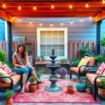
Accent Wall Paint Techniques
Creating a focal point with an accent wall transforms your porch into a more ever-changing space. We suggest painting the wall behind seating areas or along one side in a distinct color that complements your home’s exterior palette. Soft peach tones add warmth and create a welcoming atmosphere without overwhelming the space.
Nature-inspired greens work particularly well for accent walls as they harmonize with surrounding landscaping. These colors allow for playful experimentation while maintaining visual cohesion with your home’s overall design. Seasonal color changes become possible with accent walls, letting you refresh your porch’s appearance throughout the year.
Column and Railing Color Combinations
White or off-white columns paired with darker railing colors create timeless architectural interest. Deep browns or dark greens like Charleston Green on railings offer practical advantages by concealing dirt and wear while highlighting your porch’s structural elements. This combination provides a classic look that works with various home styles.
Painting railings and columns in different shades within the same color family adds texture and depth without creating visual chaos. Dark railing colors ground the space while lighter columns maintain an open, airy feeling. These coordinating combinations create sophisticated layering that enhances your porch’s architectural details and overall curb appeal.
Seasonal Front Porch Paint Ideas to Match Your Climate

We’ve explored classic colors and bold statements, but seasonal paint choices can truly make your front porch shine year-round while complementing your local climate conditions.
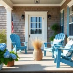
Coastal Blues and Whites
Coastal regions benefit tremendously from soothing blues paired with crisp whites that create a fresh, airy atmosphere reminiscent of ocean waves and sandy shores. These color combinations reflect sunlight effectively, helping keep your porch cooler during hot weather while maintaining that coveted beach house aesthetic. Traditional “haint blue” offers a soft, weathered appearance that’s perfect for ceiling applications, while deeper navy blues work beautifully on railings and accent features.
Bright white trim against soft blue backgrounds creates visual depth and enhances architectural details like columns, balusters, and decorative moldings. We recommend pairing these coastal hues with natural materials like weathered wood floors or wicker furniture to complete the seaside look. Light blues and whites also blend seamlessly with coastal landscaping, from ornamental grasses to salt-tolerant plants that thrive in these environments.
Autumn-Inspired Earth Tones
Fall climates call for rich, earthy colors that harmonize with changing foliage and create a cozy, inviting entrance during cooler months. Deep forest greens, warm chocolate browns, and muted rust oranges bring out the seasonal beauty while complementing natural surroundings like maple trees and oak woodlands. Sage green paired with cream trim offers a sophisticated take on autumn colors that works year-round.
Burnt sienna and olive tones create stunning backdrops for seasonal decorations like pumpkins, gourds, and autumn wreaths. We suggest using these warmer earth tones on porch walls while keeping ceilings lighter to maintain an open, airy feel. Muted gold accents on railings or decorative elements add warmth without overwhelming the overall color scheme, especially when paired with natural wood elements.
Spring Pastels and Fresh Colors
Spring climates shine with light, cheerful pastels that reflect the season’s renewal and complement blooming landscapes throughout your neighborhood. Pale lavender, soft mint green, and buttery yellow create welcoming entrances that pair beautifully with flowering plants and fresh greenery. These lighter shades reflect sunlight efficiently, making them practical choices for sunny spring and summer weather.
Soft pink tones work particularly well with vintage or shabby chic decor styles, creating romantic charm that enhances cottage-style homes and traditional architecture. We recommend balancing these gentle pastels with white or cream trim to prevent the colors from appearing too bold or overwhelming. Mint green paired with soft gray accents offers a fresh, modern approach to spring colors that complements contemporary home designs while maintaining seasonal appeal.
Modern Front Porch Paint Ideas for Contemporary Homes

Contemporary homes demand paint choices that reflect today’s clean lines and sophisticated aesthetics. These modern front porch paint strategies create striking visual impact while maintaining the sleek simplicity that defines contemporary design.
Sleek Black and White Designs
Black and white combinations create the most striking contemporary look for modern front porches. We recommend using white as your primary color to brighten and open the space, providing a clean backdrop that complements various architectural styles. Black works exceptionally well for trim, doors, and railings, adding drama and sophistication to your entrance.
Combining these contrasting colors sharply defines architectural details and creates immediate curb appeal. A white porch paired with a black front door and matching trim delivers a timeless yet modern aesthetic that never goes out of style. White paint also complements natural materials like wood, brick, and stone commonly found in contemporary porch designs.
Apply at least two coats of exterior grade paint to achieve the bold finish these high contrast combinations require. Clean all surfaces thoroughly before painting to ensure the smooth coverage that makes black and white designs so visually striking.
Minimalist Gray Palettes
Gray tones offer the most versatile foundation for contemporary front porch designs. Light gray shades make small porches feel larger and more open, while darker charcoal grays add urban sophistication and depth to your entrance.
Soft light grays provide an understated modern look that works as a neutral base for adding pops of color through door paint or decorative accessories. Muted charcoal creates an edgier aesthetic that perfectly complements contemporary architecture. These gray palettes blend beautifully with nature inspired elements like plants and wood accents.
Gray maintains sophistication without overwhelming the senses, making it ideal for homeowners who want modern appeal with lasting versatility. This neutral approach allows you to change seasonal decorations and door colors without repainting the entire porch structure.
Geometric Color Blocking
Geometric color blocking creates the boldest contemporary aesthetic for modern front porches. This technique uses sharply defined sections of contrasting colors to create ever-changing visual zones that make your entrance a standout architectural feature.
Rectangular blocks in black and white deliver maximum impact, while mixing bold accent colors with neutral bases adds personality without sacrificing sophistication. Use painter’s tape to create the clean, crisp lines essential for achieving professional looking geometric designs.
Color blocking visually breaks your porch into distinct areas, transforming a simple entrance into an artistic statement. Combine this technique with mixed materials like stone or brick to enhance texture and visual interest while maintaining the sleek aesthetic contemporary homes require.
Consider statement door colors like deep teal, mustard yellow, or navy blue to complement your geometric color scheme and create a cohesive modern look.
Farmhouse Front Porch Paint Ideas for Rustic Charm

Farmhouse style brings warmth and timeless appeal to front porches through natural textures and vintage elements. We’ll explore how to achieve that perfect rustic charm using weathered finishes, vintage color palettes, and authentic distressing techniques.
Weathered Wood Stain Effects
Weathered wood stains create authentic rustic character by highlighting natural grain patterns while adding aged appeal. We recommend choosing soft grays, faded browns, or muted tans that mimic sun-bleached wood for porch railings, floors, and columns. These natural-looking finishes preserve the earthy feel that defines farmhouse design without requiring heavy paint layers.
Applying weathered stains to porch elements gives your entrance instant character and history. The technique works particularly well on cedar and pine surfaces where wood grain adds visual texture. We’ve found that combining multiple weathered stain tones creates depth and prevents the flat appearance that single-color treatments sometimes produce.
Natural wood preservation remains key to authentic farmhouse styling. Weathered stains allow the wood’s inherent beauty to shine through while protecting against weather damage. This approach creates the perfect foundation for layering other farmhouse elements like vintage planters and rustic seating.
Vintage-Inspired Color Combinations
Vintage farmhouse porches embrace muted, earthy color palettes that evoke nostalgia and timeless charm. We suggest starting with warm browns and taupes as your base colors, then adding creamy whites and soft beiges for contrast. These harmonious combinations work beautifully with natural wood elements and weathered finishes.
Accent colors like muted sage and olive greens bring life to farmhouse porches without overwhelming the rustic aesthetic. We recommend introducing these softer hues through painted porch furniture, decorative planters, or ceiling treatments. Faded blues and light grays also complement the vintage-inspired palette while maintaining the authentic farmhouse feel.
Balancing warm and cool tones creates visual interest in vintage color schemes. Pairing deep greens with creamy whites establishes a classic farmhouse look that feels both fresh and historically grounded. We’ve seen excellent results when homeowners use these vintage combinations across multiple porch elements for cohesive styling.
Distressed Paint Techniques
Distressed painting transforms new surfaces into authentically aged farmhouse features through intentional wear techniques. We achieve this weathered look by sanding or scraping paint layers to reveal underlying wood or previous paint colors. This method works exceptionally well on porch furniture, planters, vintage signs, and railings.
Creating visual texture through distressing adds authenticity to farmhouse exteriors by suggesting history and lived-in comfort. We recommend combining painted and stained wood elements with distressed finishes for balanced farmhouse appeal. The technique tells a visual story that makes new construction feel like it has generational charm.
Strategic distressing placement enhances the farmhouse aesthetic without appearing artificial. Focus distressing efforts on high-touch areas where natural wear would occur, such as chair arms, table edges, and door frames. We suggest practicing the technique on scrap materials before applying it to finished porch elements to achieve the desired level of aging.
Small Front Porch Paint Ideas to Maximize Space

Small front porches require strategic paint choices to create the illusion of spaciousness. We’ll explore proven techniques that visually expand compact outdoor areas while maintaining style and functionality.
Light Colors to Open Up Space
Light paint colors reflect more natural light and create an airy atmosphere that makes small porches feel significantly larger. Off white shades with subtle gray or blue undertones work exceptionally well for siding, columns, and doors because they brighten the entire space without appearing stark. We recommend pairing these lighter tones with deeper grounding colors like rich brown on stairs and railings to establish visual contrast and prevent the space from appearing washed out.
Benjamin Moore’s “Chantilly Lace” serves as an excellent base color that opens up confined spaces while maintaining sophistication. Cream alternatives like Sherwin Williams “Creamy” provide warmth while still achieving the space expanding effect that light colors deliver. These pale hues reflect both natural sunlight and artificial lighting, maximizing brightness throughout the day and evening hours.
Vertical Stripe Patterns
Vertical stripes painted on porch walls or columns draw the eye upward and create the perception of increased height in compact spaces. This technique works particularly well on shorter porches where ceiling height feels limiting, as the upward visual movement makes the entire area appear more spacious and open. We suggest using two tones within the same color family to maintain cohesion while achieving the desired vertical emphasis.
Painting narrow vertical stripes on porch columns transforms structural elements into height improving features that contribute to the overall spacious feeling. The pattern adds visual interest without overwhelming the limited square footage, creating a stylish detail that serves both aesthetic and spatial purposes. Alternating between a base color and a shade two tones lighter produces subtle definition that maximizes the height illusion.
Strategic Accent Colors
Strategic accent placement draws attention to architectural features while creating depth perception that makes small porches feel more ever-changing and spacious. Painting the front door in a complementary or contrasting color establishes a focal point that pulls the eye forward, creating visual layers that add dimension to compact spaces. Light blue porch ceilings, following the traditional southern practice, expand the visual reach upward while creating a calming atmosphere that feels open and inviting.
We recommend limiting accent colors to one or two key elements to avoid overwhelming the small space with competing focal points. Brighter door colors like deep navy or forest green create striking contrast against light wall colors while maintaining the space improving benefits of the overall light color scheme. Warm brown accents on wooden elements like Natural Cedartone enrich natural textures without darkening the space, particularly when paired with classic off white trim that maintains brightness and cleanliness throughout the porch area.
Front Porch Floor Paint Ideas for Durability and Style

Choosing the right porch floor paint elevates both the appearance and longevity of your outdoor space. Quality floor coatings protect against weather damage while creating an attractive foundation for your overall porch design.
Concrete Stain Options
Concrete stains offer a sophisticated alternative to traditional paint by improving the natural texture of your porch floor. We recommend these staining answers because they penetrate the concrete surface rather than sitting on top like paint, creating a more permanent and durable finish.
Acid-based stains create rich, variegated colors that develop unique patterns as they react with the concrete. These formulas work particularly well for achieving earth tone finishes that complement natural surroundings. Water-based stains provide more consistent color coverage and come in a wider range of hues, making them ideal for achieving exact color matches.
Stained concrete floors resist peeling and chipping better than painted surfaces because the color becomes part of the concrete itself. Most concrete stain applications also include sealing treatments that further enhance durability and weather resistance.
Porch Floor Paint Colors
Classic dark browns like Benjamin Moore Wood Grain Brown or Sherwin-Williams Oak Leaf Brown create traditional elegance perfect for Colonial or Federal-style homes. These rich tones provide a formal foundation that complements architectural details and enhances curb appeal.
Bold colors transform porches into vibrant focal points with options like Benjamin Moore Eggplant or Hawthorne Yellow working especially well for tropical or Victorian-style homes. Bright reds deliver strong visual impact with minimal effort, creating dramatic contrast against neutral wall colors.
Neutral hues and whites offer versatile styling that complements porch railings and trim for clean, understated aesthetics. We suggest pairing bright floor colors with neutral walls to balance boldness while maintaining visual harmony throughout your porch design.
Non-Slip Paint Answers
Anti-skid additives incorporated into porch floor paints significantly improve safety, especially during wet conditions. Rust-Oleum offers specialized anti-skid finish options in their floor coatings that provide enhanced traction without compromising appearance.
High-quality porch paints like Kilz Porch & Patio Floor Paint resist scuffs, cracks, and mildew while drying quickly for easy application. Valspar Latex Satin Porch, Floor & Patio Paint delivers weather and scratch resistance with smooth application and extensive color options.
Adding sand or grit additives to standard porch floor paint creates custom non-slip surfaces customized to your exact safety needs. We recommend testing texture additives on small areas first to achieve the desired grip level without creating surfaces that are difficult to clean or maintain.
Conclusion
Your front porch deserves thoughtful attention as it sets the tone for your entire home’s exterior appeal. We’ve explored countless paint possibilities that can transform your entrance from ordinary to extraordinary while reflecting your unique style preferences.
Whether you’re drawn to timeless white elegance bold statement colors or modern minimalist approaches the key lies in choosing combinations that enhance your home’s architecture. Remember that quality materials and proper preparation ensure your chosen colors will withstand weather conditions and maintain their beauty for years to come.
Start with your favorite color palette from our guide and don’t hesitate to test samples in different lighting conditions. Your perfect front porch transformation awaits and with these proven ideas you’re well-equipped to create an entrance that welcomes guests and makes you proud every time you come home.
Frequently Asked Questions
What is the most popular front porch paint color?
White is the most popular front porch paint color because it creates a timeless, welcoming atmosphere that complements any architectural style. Classic white provides excellent curb appeal and works beautifully with various accent colors, making it a versatile choice for homeowners seeking a clean, sophisticated look.
How do I choose the right paint color for my front porch?
Consider your home’s architectural style, existing exterior colors, and personal preferences. Start with your home’s main color scheme and choose complementary or contrasting colors. Factor in your climate, surrounding landscape, and whether you want a bold statement or subtle elegance to guide your decision.
Can I use regular paint on my front porch floor?
No, regular interior paint won’t withstand outdoor conditions. Use high-quality porch and floor paint specifically designed for exterior surfaces. These paints resist weather damage, foot traffic, and UV rays. Consider concrete stains or non-slip paint options for better durability and safety.
What are the best bold colors for front porches?
Deep navy blue, forest green, and rich burgundy are excellent bold choices for front porches. Navy blue like Benjamin Moore’s “Hale Navy” creates striking contrast with white trim. Forest green blends naturally with landscaping, while burgundy adds dramatic warmth and sophistication to your entrance.
How can I make my small front porch look bigger?
Use light colors like white or cream to reflect light and create an airy feel. Paint ceilings lighter than walls, and consider vertical stripe patterns to add height. Limit accent colors to avoid overwhelming the space, and use strategic color placement to highlight architectural features.
Should I paint my porch ceiling a different color?
Yes, painting your porch ceiling a different color adds visual interest and dimension. Light blue (“haint blue”) is traditional and creates a sky-like effect. You can also use lighter shades of your main color or crisp white to brighten the space and create contrast.
What colors work best for farmhouse-style porches?
Farmhouse porches look best with weathered wood stains, warm browns, and creamy whites. Add vintage charm with muted sage green or faded blue accents. Consider distressed paint techniques to create an authentically aged appearance that enhances the rustic, farmhouse aesthetic.
How often should I repaint my front porch?
Repaint your front porch every 3-5 years, depending on weather exposure and paint quality. High-traffic areas like floors may need repainting every 2-3 years. Use high-quality exterior paints and proper surface preparation to extend the life of your paint job and maintain curb appeal.
Can I use two different colors on my front porch?
Absolutely! Two-tone color schemes create depth and visual interest. Use lighter colors on structural elements and darker shades on floors or ceilings. Try contrasting column and railing colors, or create accent walls for dynamic appeal while maintaining overall design cohesion.
What paint finish is best for front porches?
Use semi-gloss or satin finish for porch surfaces as they resist moisture and are easy to clean. For floors, choose specialized porch and floor paint with a slight texture for slip resistance. Avoid flat paint on exterior surfaces as it doesn’t withstand weather conditions well.